Certainty of the estimated Standardized Incidence Ratios (SIRs)
The probability that the SIR truly deviates from the Dutch average is shown in the V-plot (see “V-plot and Wave-plot" below) and by using different colour intensities on the map (see “transparency” below). The credible interval is shown in the Wave-plot (see “V-plot and Wave-plot" below).
Calculating the probability of SIR
For each area on the map, the goal is to determine whether the SIR is lower or higher than 1, where a value of 1 represents the Dutch average. An SIR lower than 1 indicates that the incidence is lower than expected, while an SIR higher than 1 indicates a higher-than-expected incidence. The SIR is estimated using Bayesian models, as mentioned in the "Statistical Model for Cancer Diagnoses" section, based on prior distributions (prior knowledge) and observed data, resulting in a posterior distribution. The median of this range is the SIR which is displayed for each area in the atlas.
To calculate the probability that the SIR truly deviates from the Dutch average, we examine how many of the estimated SIRs in the posterior distribution are above or below 1. If a significant portion of the posterior distribution is below 1, this indicates that many estimates are below 1. This makes it more likely that the area indeed has a lower SIR than expected based on the Dutch average. The same principle applies to areas with a higher SIR; here we determine the percentage of the posterior distribution above 1. The formula for this calculation is as follows:
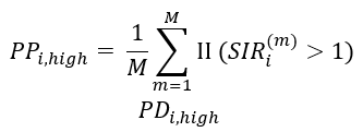
PDi,high refers to the posterior probability that the estimated SIR in area i is greater than 1. SIRi(m )is the m-th estimate of the SIR from the posterior distribution for area i. ΙΙ is an indicator-variable: it takes the value 1 if the expression in parentheses (SIR is greater than 1) is true and the value 0 if not.
For SIRs with a lot of uncertainty, the value 1 will be close to the centre of the posterior distribution. This results in PDi,low and PDi,high values close to 0.5.
Certainty is calculated as follows:
PPD= |PDi,high - PDi,low|
where the vertical lines denote absolute value and PDD stands for ‘Posterior Probability Difference’.
This means that the estimated SIRs with a high PDi,high or a high PDi,low will have a high PPD value, while observations with a PDi,high and PDi,low close to 0.5 (almost as many estimates above as below 1) will have a low PPD value. A high PPD value thus indicates a high level of certainty that an area deviates from 1, and a low PPD value indicates little certainty that an area deviates from 1.
Transparency
In the Dutch Cancer Atlas, areas with a high SIR are red, while areas with a low SIR are blue. Areas that have SIR close to the average are yellow. Areas with a high or low SIR, but with a lot of uncertainty around the SIR, are also yellow, making them less prominent on the map. See Figure 8a. In this way, we take random outliers in the data into account; SIRs that probably do not deviate from the Dutch average.
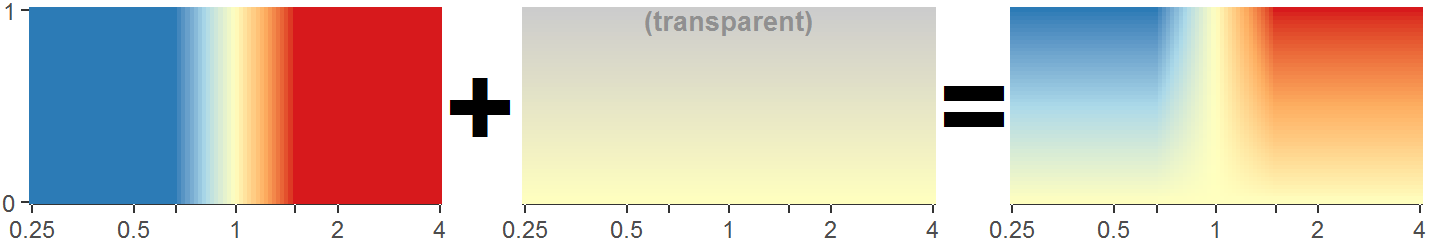
Figure 8a: The X-axis shows the estimated SIR and the Y-axis shows the a-posteriori probability difference (PDD). The left figure displays the colour layer based on the average SIR alone. The middle figure presents a yellow layer that becomes more transparent as the PDD increases, which indicates greater certainty about the estimated SIR. On the right is the combination of these two colour layers, showing that for areas with a higher PDD value, the intensity of the blue, yellow or red colour is maintained. Areas with a lower PDD value are more yellowish.
V-plot and Wave-plot
When clicking on an area in the atlas, the figure below will appear in the Statistics panel on the right (Figure 8b).
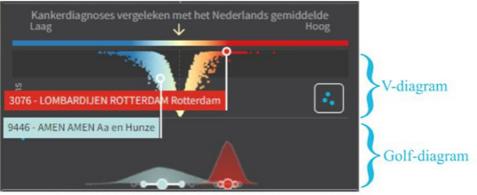
Figure 8b. V-plot (V-shaped upper part), wave-plot (wave-shaped lower part) with 60% and 80% credible intervals (dots and lines underneath the wave plot)
V-plot
The V-plot displays the estimated (median) SIR (Standardized Incidence Ratio) for each area in the atlas and the probability that the SIR actually deviates from the Dutch average. On the X-axis, the SIR is plotted against the Dutch average (which is equal to 1). The values on the Y-axis indicate how likely it is that the SIR truly deviates from the average. This value is the a-posteriori probability difference (PPD). The higher the PPD, the more likely it is that the SIR actually deviates from the Dutch average. The lower the PPD, the less likely. Areas with an SIR near 1 often have a low PPD, and areas with a very high or very low SIR often have a high PPD. For this reason, the figure has a V-shape. For the Dutch Cancer Atlas, it is assumed that when the PPD is greater than 0.60, there is sufficient certainty that the SIR actually deviates from the Dutch average. This cutoff is indicated in the plot by a subtle difference in the black background colour. In the figure, you can see that the upper part of the plot has a darker black background than the lower part. For all SIRs in the darkest part the PPD is greater than 0.60, and it is assumed that these actually deviate.
Wave-plot
In the image of the V-plot, two random areas are highlighted (3076 in Rotterdam and 9446 in ‘Aa en Hunze’). Underneath the V-plot, the wave-plots for these two areas are shown. The wave-plot shows the a posteriori distribution of the estimated SIRs for each area. The width of the wave-plot indicates how precise the estimate for the corresponding area is. The narrower the wave-plot, the more precise the estimate. For example, the estimate for Rotterdam is more precise than the one for ‘Aa en Hunze’.
The credible intervals shown in these wave-plots can be used to provide more information about the location of the actual SIR of an area. In each wave-plot, the a posteriori median SIR is represented by the largest dot in the middle. Around it, two intervals are shown using smaller dots. The interval closest to the median SIR is the 60% credible interval: 60% of the a posteriori distribution lies within this interval. This can be interpreted as there being a 60% probability that the actual SIR of this area lies within this interval. The two outer dots represent the 80% credible interval, within which 80% of the a posteriori distribution lies. This can be interpreted as there being an 80% probability that the actual SIR lies within this interval.